CATEGORY
Editorial
Illustration
DESCRIPTION
Julieta, an experienced couples therapist, had been mulling over her therapeutic workbook for a while. She had everything very clear: which exercises, how she would present them, the foreword she wanted to write, how she wanted to promote it. But she needed someone to bring all of that into reality and conceptualize it. And that’s where we met: it was love at first sight.
The starting point
Julieta had contacted several publishing houses, but she wasn’t entirely satisfied with what they offered: she didn’t like the direction the illustrations they showed her were taking, and she didn’t feel entirely comfortable with the proposed process. So, she took matters into her own hands to find a way to edit it, and I assisted her with all the visual aspects, as well as providing editorial and grammatical support, something I’m passionate about and have experience with from my time as a journalist. I proposed a plan that would be divided into two phases: first, we would search for the concept around which the book would revolve through the illustrations, and then we would move on to the editorial design part.
The concept: no gender
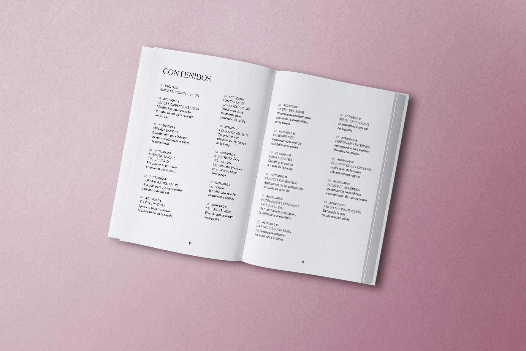
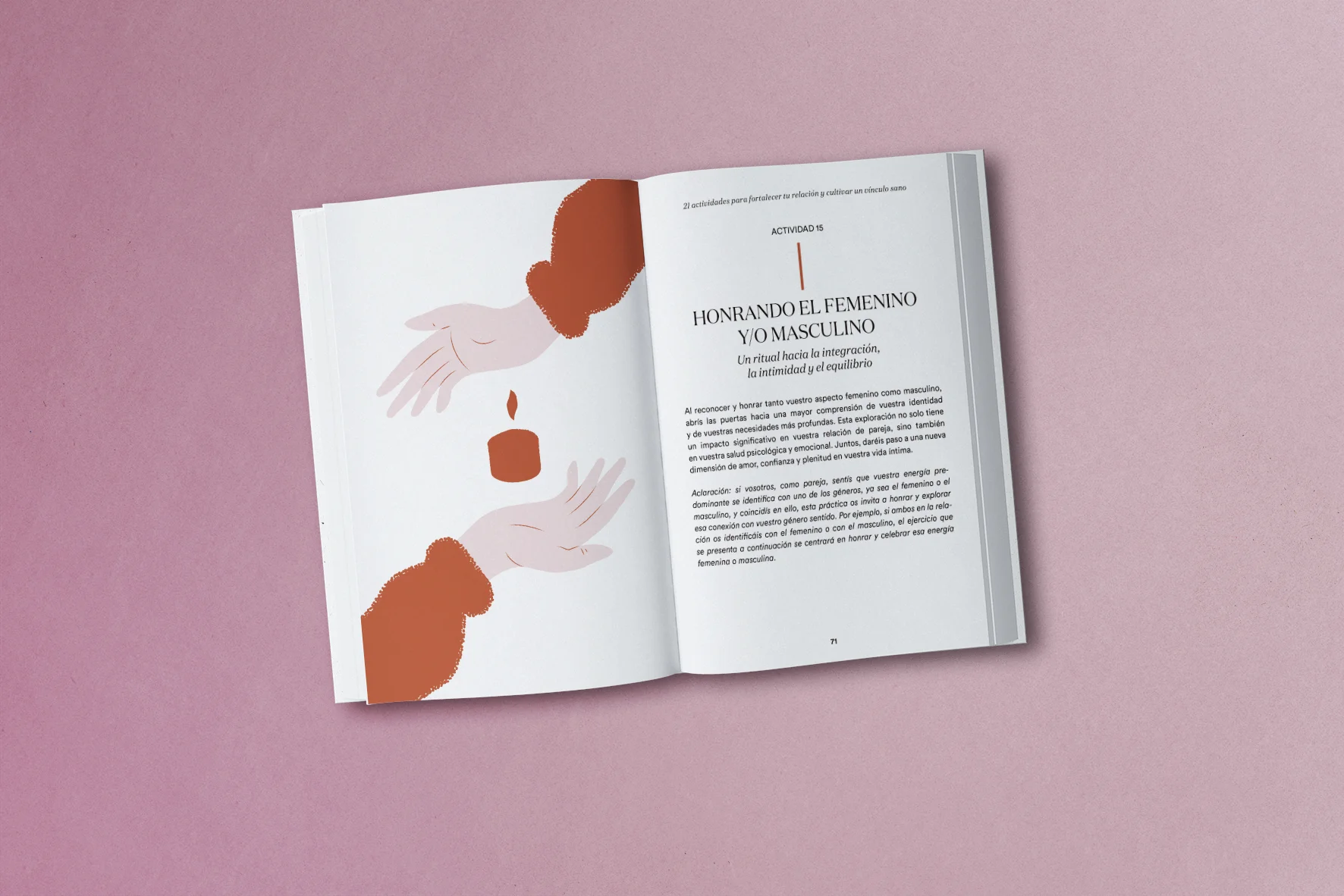
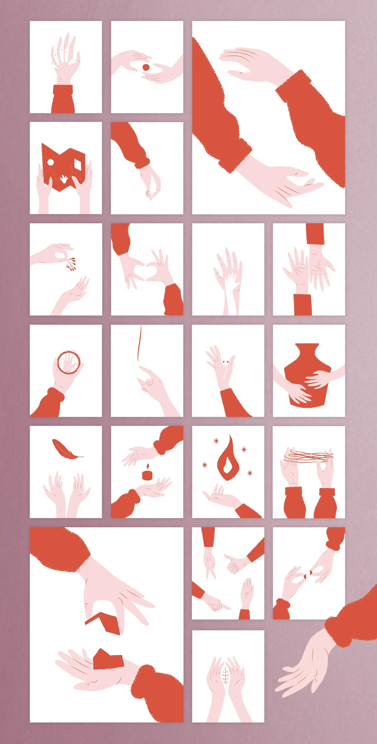
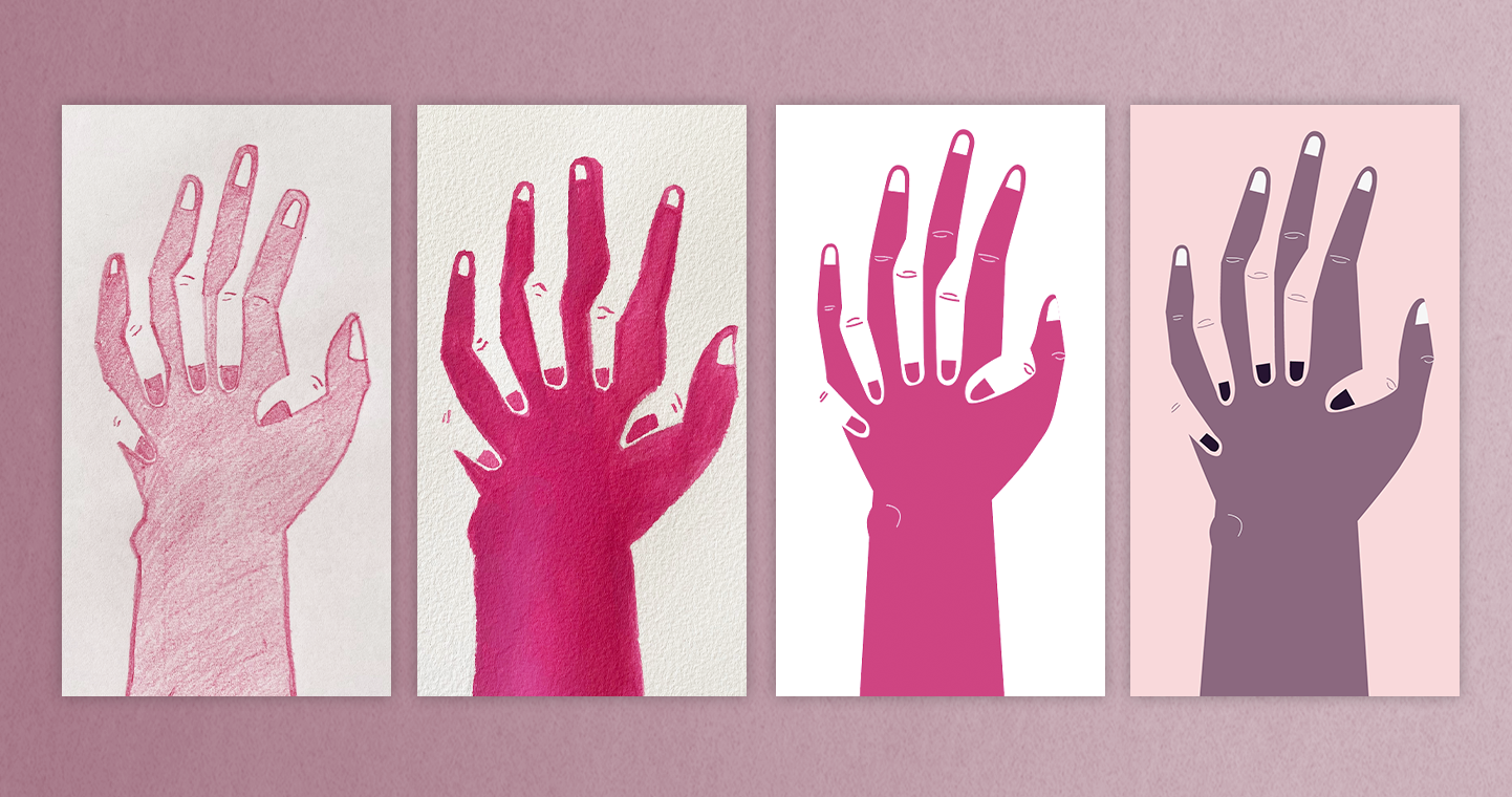
So, we began by searching for the overarching concept that would tie the whole book together. She wanted simple illustrations, she talked to me about lines, ones that had strength but were also sensitive, ones that would resonate with the reader. I had to find something that could help me represent the 21 exercises, with a common thread that would assist me in the process without overly complicating it. And I was very clear about one thing: even though Julieta hadn’t explicitly asked for it, considering it was a book about love and couples, I wanted to find a way to represent each of the exercises without needing to specify gender, to be as inclusive as possible, without defining what a couple should look like. So I find my way, it had to be like this: we would use hands (and maybe other objects not to be too repetitive) throughout the book.
So, we had a zoom meeting, I told her my idea, and she loved it. “Go ahead, you have my full trust,” she said. And in a couple of days, I sent her some initial tests I had done. I wanted her to see some examples of techniques, to feel which ones resonated best with her, and I also made some initial color exercises.
Colors
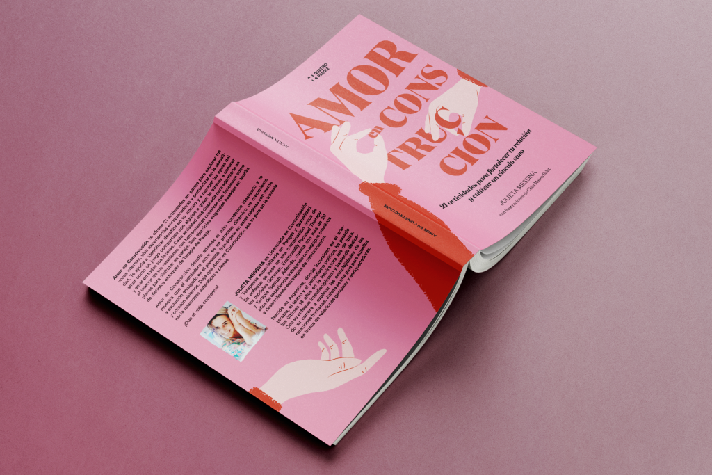
She decided that we would go the digital route, which she liked the most, and in reality, it also made our work more agile. If we wanted a color change, we had it instantly without having to redraw it all over again. We did several color tests, and although initially, I was convinced that the one we were using was the one that resonated most with the book (pale hands and dark lilac clothes), Julieta insisted on having the cover in red and pink. And of course, if we had the cover in that color, it didn’t make sense for the inside to be in another color, so we had to change everything. That’s how she felt: she wanted it to grab attention and have strength, and I tried to convince her that the content was more in line with what we had then. But she won by being stubborn, and in the end, I actually saw that she was right: the book gained a lot of power, and it also complemented the text wonderfully, even if it was from a different angle.