CATEGORY
Branding
Web Design
DESCRIPTION
Joelle approached me during a period of transition in her life. She had decided to leave her current job in search of a fresh start and was seeking a professional website to showcase her skills to specific individuals she wished to collaborate with. While she had certain ideas and references in mind, she granted me complete creative freedom. I believe we successfully met her expectations and created a personal branding and website that perfectly aligned with her vision.
Joelle’s identity
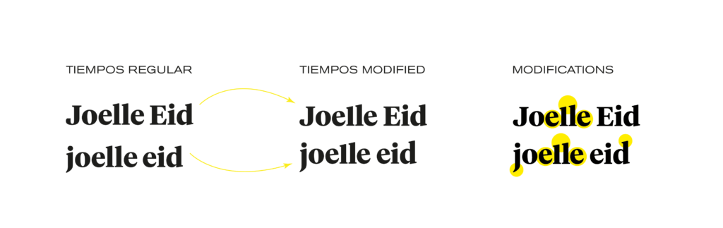
“I want a brand that balances calm feminine energy with bold feminine energy” – that’s one of the things Joelle expressed during our interview for creating her personal brand. The challenge for me was to create a branding that exuded strength while still being relatable and approachable. I conducted several typography tests and found that Tiempos worked perfectly. It had an elegant touch with a modern and friendly feel.
Using Tiempos as the foundation, I made some modifications to enhance the brand’s presence. I vertically elongated the “j” and “d” in the logo to create a sense of stability. Additionally, I slightly rotated the two “e” characters to add a friendly touch. To inject playfulness while maintaining subtlety, I manipulated the double “l” to form a diagonal element.
After careful consideration, we decided to go with lowercase letters. Although capitalizing the first letter conveyed formality and elegance, we believed that familiarity and closeness were more important. The lowercase version helped us achieve that desired connection with Joelle’s audience.
Colors
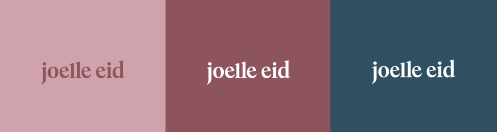
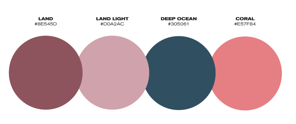
For the branding colors, we selected a combination that represented Joelle’s vision. The primary color chosen was “Land,” as it evoked a sense of calmness, groundedness, and strength while maintaining a feminine touch. This color provided a solid foundation for the brand’s identity.
To add a formal yet vibrant contrast, we incorporated “Deep Ocean” as a secondary color. This cold, contrasting hue added depth and sophistication to the overall color palette. It brought a sense of professionalism while still allowing for a touch of color and visual interest.
Lastly, we introduced “Coral” as a vibrant and vivid accent color. This lively shade added bursts of energy and caught the eye, bringing attention to specific elements or areas of the brand. The use of coral as an accent color injected a dynamic and lively quality into the overall visual identity.
The combination of these three colors—land, deep ocean, and coral—resulted in a branding color scheme that achieved a delicate balance. It represented Joelle’s desire for a calm and feminine energy while also incorporating strength, formality, and vibrant accents to create a visually engaging and appealing brand identity.
Typography
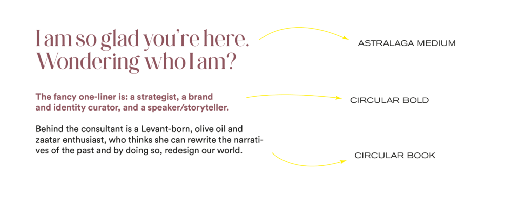
For the typography, we chose “Astralaga” for the headlines, as it brought a playful touch with hints of fantasy while maintaining an elegant and sophisticated aesthetic. This font added a whimsical and imaginative element to the brand identity.
In contrast, we opted for “Circular” to complement the overall design. Circular provided a modern, simple, and geometric look that exuded a sense of sleekness and minimalism. Its transparency and clean lines allowed for clear and direct communication. The choice of Circular typography added a contemporary and forward-thinking vibe to the brand.
By combining Astralaga for headlines and Circular for other text elements, we achieved a contrasted but harmonious typographic composition.
Web design
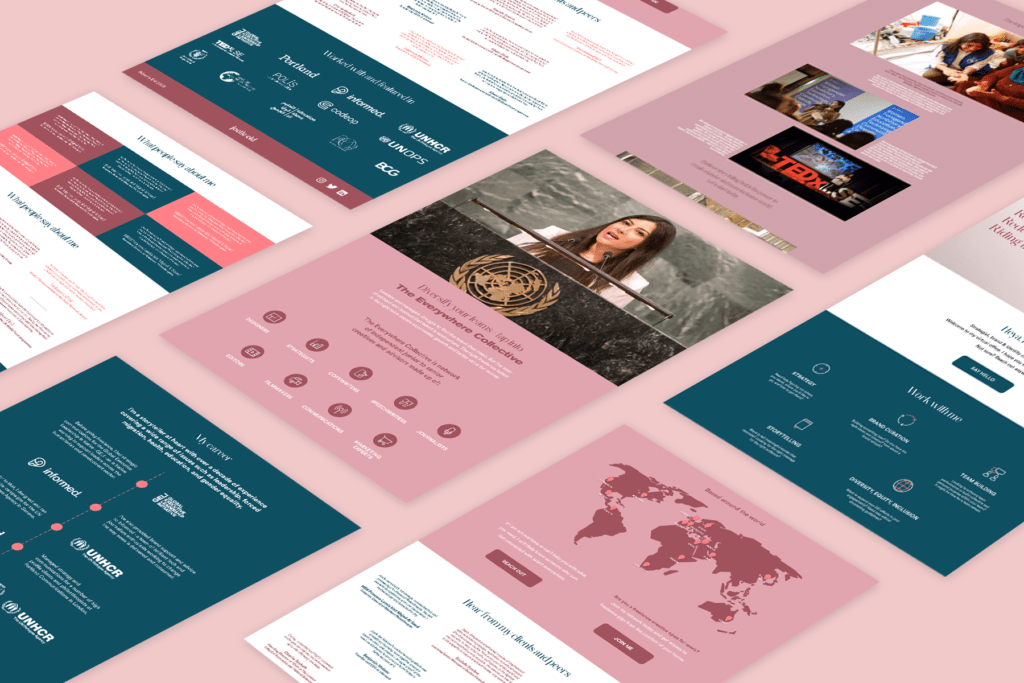
For the web design, we aimed for minimalistic communication, focusing on concise text and utilizing infographics to convey information effectively. The brand’s colors were strategically incorporated throughout the design to achieve the perfect balance and create a cohesive visual experience.
We prioritized essential information, ensuring that visitors could quickly grasp key messages without being overwhelmed by lengthy paragraphs. This approach allowed for a clean and streamlined design, promoting a user-friendly browsing experience. Infographics and icons played a vital role in presenting information in a visually engaging and easily digestible format. Infographics also added visual interest and served as a memorable way to showcase important details.
Careful attention was given to striking the right balance, ensuring that the colors were visually pleasing, not overpowering, and complemented the overall minimalistic approach.