CATEGORY
Branding
Graphic Design
Illustration
DESCRIPTION
Àpats & Soul is a collaborative social catering initiative based in Sant Cugat, born from the union of two local cooperatives. The project focuses on collective catering services, prepared with organic, local ingredients, and aims to combine quality food, social inclusion, and sustainability. The brand seeks to communicate a warm, approachable, and modern personality, reflecting values of transparency, fairness, healthy cooking, and social commitment.
Naming
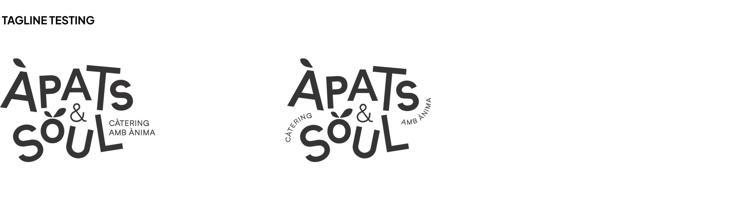
At first the brand underwent a naming consultancy. Initial proposals included Àpats de Collserola, and we even developed some logos with that naming to test the feeling and look of the brand, but after review and refinement, the final name Àpats & Soul was chosen to better reflect the social, lively, and soulful essence of the project.
Logo
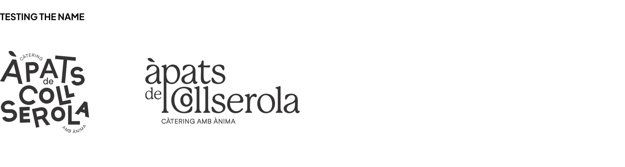
Several logo concepts were explored before arriving at the final solution:
- Option 1 – A sans-serif font with uneven, unaligned letters of varying sizes, complemented by simple elements such as a subtle orange motif. It conveyed a casual, approachable feel.
- Option 2 – A serif lowercase font with a more elegant but friendly tone, including playful faces and fruit elements to reinforce the social and human aspect.
- Option 3 – A mix of sans and handwritten letters, aiming for a modern, diverse, and playful look, emphasizing dynamism without relying on decorative elements.
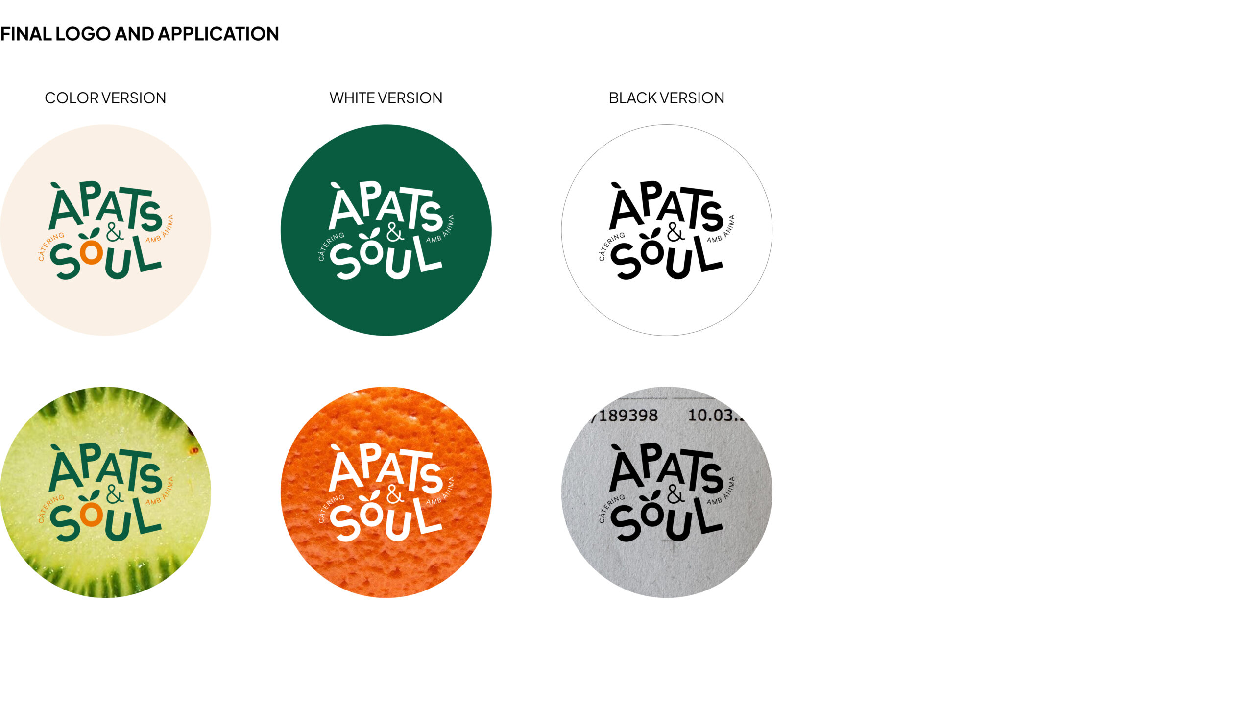
After testing, the client chose option 1, with a leaf detail on the “O” of “Soul”, subtly referencing fruit and vitality. The “O” is slightly elevated to suggest the concept of soul. They felt this option was subtle, modern and timeless and met their needs best.
Tagline
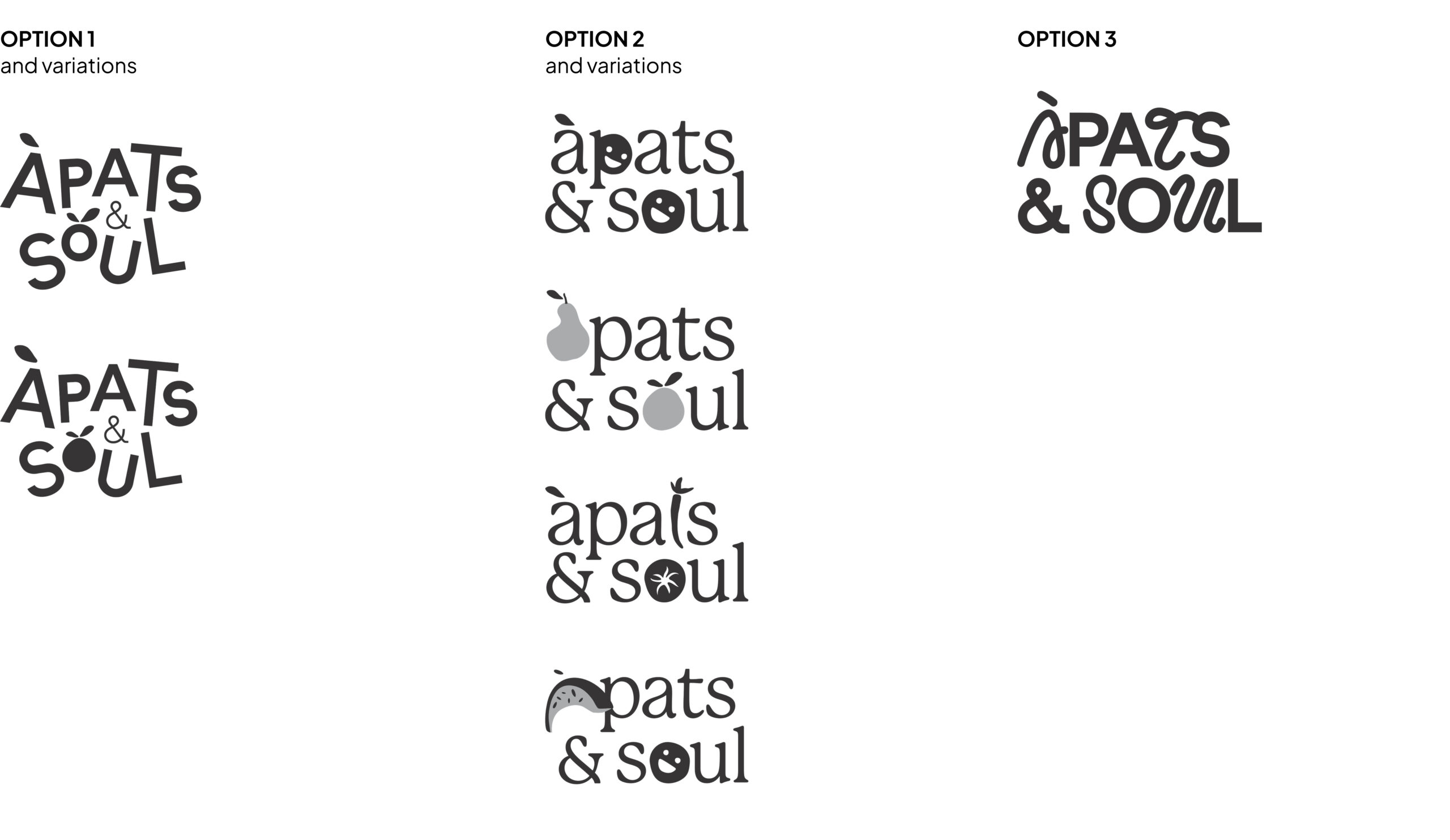
Once the main logo was finalized, we explored different ways of integrating the tagline “Catering amb ànima” with the logotype. Various placements, orientations, and curves were tested to find a solution that felt dynamic, organic, and well-integrated with the overall logo composition.
The final choice wraps the tagline around the logo in a circular manner, creating a playful rhythm while maintaining readability. This approach reinforces the brand’s soulful, approachable, and lively personality, and visually connects the tagline with the essence of the project.
Final logo and color Palette
We finally got to the color version of the logo which includes orange and green and complemented those with a third neutral color. The brand’s primary colors are:
- Dark Green – Represents vegetables, nature, and organic food. Conveys solidity, serenity, and trust.
- Orange – Adds vitality, warmth, and a subtle fruit reference, reinforcing energy and approachability.
- Cream (complementary) – Used as a background color, warmer than white, evoking earthiness and offering a cozy, welcoming feel.
Typography
Àpats & Soul uses a clear, modern typographic system that balances personality with readability across applications:
- Unbounded – Used for headlines and highlighted text, this sans-serif typeface has open, rounded forms that convey warmth, approachability, and a handcrafted feel. It’s modern, versatile, and expressive, perfectly reflecting the brand’s social and soulful identity.
- Plus Jakarta Sans – Used for body text and main content, this modern sans-serif is clean, highly readable, and professional. It provides a neutral, structured foundation that complements the expressive nature of Unbounded while remaining contemporary and approachable.
- Ubuntu Sans Mono – Used sparingly for technical data, labels, or highlights, this monospaced typeface adds a differentiated touch for numerical or structured information without conflicting with the main text.
This combination allows the brand to communicate clearly, with hierarchy and personality, while maintaining flexibility across print and digital applications.
Complimentary colors and ilustrations
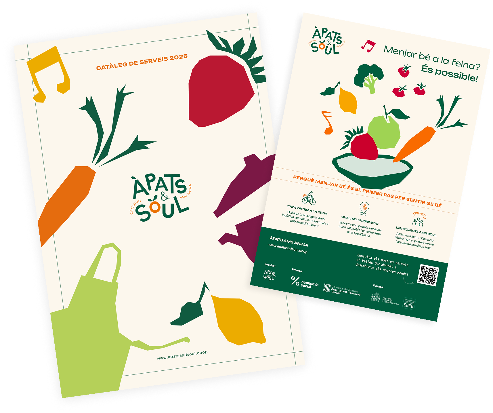
Àpats & Soul illustrations are designed to emulate simple and modern figures, reflecting a friendly and straight-forward tone. They depict:
- Food and ingredients
- Kitchen tools and utensils
- Musical elements connected to the soul concept
Illustrations serve as complementary visuals, enhancing certain applications and communication pieces while reinforcing the brand’s warmth, creativity, and personal touch.
A palette inspired by fruits and vegetables—such as lime yellow, aubergine, and strawberry red—is used sparingly for illustrations, icons, packaging, or infographics, providing vibrancy and freshness while maintaining brand coherence.
Web
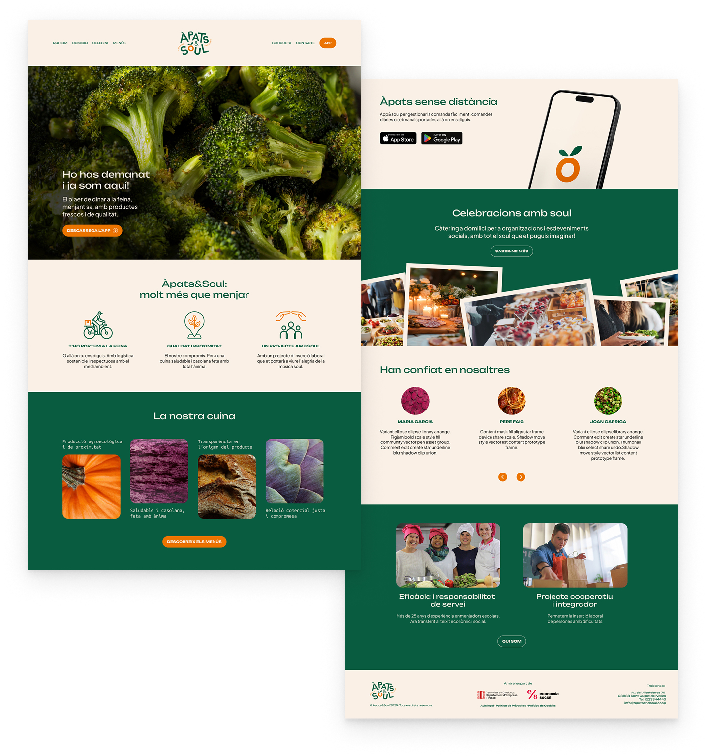
The Àpats & Soul website is designed as a clean, user-friendly portfolio that highlights the brand’s projects, services, and values. Key features include:
- Structured sections showcasing work, social impact, and cooperative background.
- Video and image integration, with a focus on high-quality visuals of food, ingredients, and illustrative elements.
- Consistent application of brand elements, including the logo, color palette, typography, and illustrations, ensuring a coherent and engaging user experience.
The website acts as both a presentation tool and a storytelling platform, reinforcing the brand’s identity and connecting visitors to the social and culinary values of Àpats & Soul.